


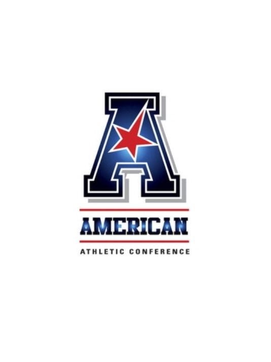
Not only did "The American" copy C-USA with a patriotic name, they also made a star the prominent feature in their logo and as expected used the same colors as C-USA.
Primary logo:
Secondary logo:


|
|
|

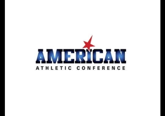
Not only did "The American" copy C-USA with a patriotic name, they also made a star the prominent feature in their logo and as expected used the same colors as C-USA.
Primary logo:
Secondary logo:


CUSA should sue 'em for trademark infringement.
We shouldn't sue them. We should be flattered. It shows what a great brand C-USA is.Originally Posted by HogDawg

You would think that The American would want to distance themselves as far from C-USA as possible considering their new membership, but The American's branding screams the same message of C-USA.
I think Aresco is in over his head.
I agree that Aresco is in over his head. But I disagree about being "flattered". If you don't defend your trademark --or even specific parts of your trademark, such as "stars", etc...-- you can lose the trademark protection. In my opinion, the AAC's "star" is too similar to CUSA's.
It looks like a Costco value brand label. It's really bad!
They are so similar and so many teams in the new American conference used to be in the USA conference.... there may be confusion by outsiders of which conference is which and which teams are in which conference. I'm fine with that because it is basically "former CUSA conference" and "new CUSA conference."


I think this is the correct assessment. It does nothing but add to perceived parity between the conferences.
The "Me too" Conference.


90% same "A" font of Appalachian State
I think their massive marketing loss is our massive marketing gain!
or
UT-Arlington logo

or
WCC

WCC is way better...AAC looks like the designer just discovered how to use Photoshop gradients
Photoshop? Don't get ahead of yourself. Powerpoint.
American Football League circa 1960's

 Posting Permissions
 Reply With Quote
