Good. State T and La Tech. Here I stand.Originally Posted by dawg80


|
|
|


Good. State T and La Tech. Here I stand.
Actually, I think he's leaning toward the logo being a bulldog riding a bucking bronco! :icon_wink:


I just heard through the grapevine, the new AD is gonna weigh in on everything.:icon_wink:
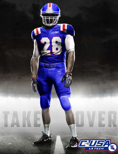
Louisiana Tech University
Flagship of the University of Louisiana System

Did this a few months ago.
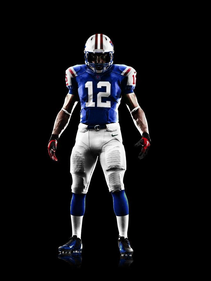

Damn, that is sweet, Qng!
It's the Buffalo Bills
A side by side comparison
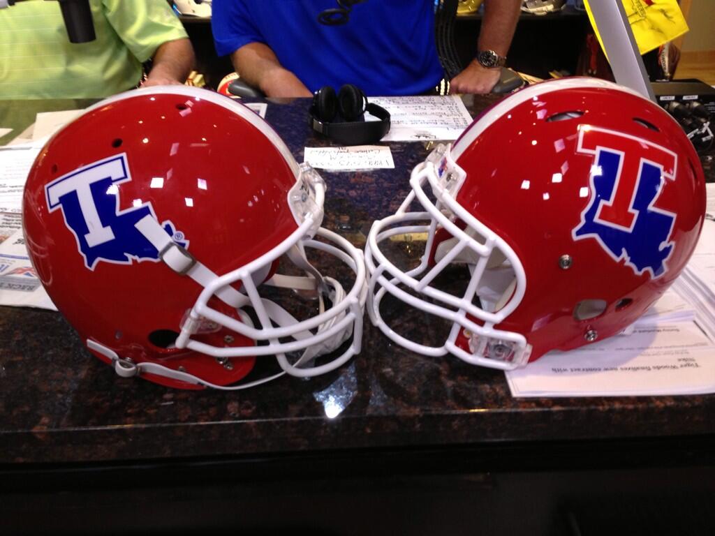
Alot of the complaints are that it won't look good on t.v. I re-watched the aTm game and you can't tell what the decal looks like unless they are zoomed in on a player. I don't see how the new one will be any different. They both look like blobs on the helmet from far away.
Side by side I like the new one better. Much mroe consistent with our other branding efforts.
It's not consistent with our branding efforts. Our branding efforts are centered around the LATECH logo, not the T-state logo.
The white T stands out so much more. All you have to do is go to the LATech Equipment twitter account to see that the red T is invisible on the red helmets from a distance. This change was a big mistake.

In the picture above the new helmet sticker looks to be significantly bigger than the old one, partcularly the T.
What color is the T on the LATECH logo?...... exactly. Like I said.
T-state? Or state-t? We can't even get this right now.
Help us Tommy McClelland, you're our only hope!
I don't think the red t will stand out on camera.
The white T doesn't stand out until you zoom in on the players.
 Posting Permissions

 Reply With Quote