
|
|
|


Got the tweet last week on these...
I like them as long as the W's follow -
I would of put the Dawg head on the front v of the neck or on the back of the shorts just below the waist and above the butt
But they are good looking - we have worn much worse
Looks like there may be some design on the back of the top that is visible when the player sweats
''Don't be a bad dagh..."


It's Duke's uniform template.
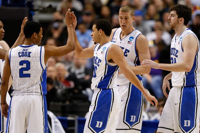
posted this on BTB...Marshall wears the same exact design too. According to helmetgame.com, this "jerseys feature the Nike Hyper Elite styling of a narrower, streamline cut, and a new material base for a lighter feel."

I like them. We are wearing the good Nike stuff.

Glad to see more red trim on the new unis. Always thought the old ones looked like they were just blue and white.
Now if the football team can follow suit and get the pro-combat style jerseys.Originally Posted by qng001


Here comes the fuddy duddies.... "If it ain't broke, don't fix it!"

Not even comparing apples to apples...
Alt helmets alone are almost $50K -
For $50k you can outfit the basketball team for 10 years
''Don't be a bad dagh..."
As you know the helmet logos were not changed in order to make them look better. They were changed to "conform with the branding". The new logos are okay. IMO, they just don't look any better than what we had. A few people say they wanted a change, but I never recall reading that particular change would help one of the best logos in college football look better. I don't believe it did.
 Posting Permissions


 Reply With Quote

