Hmmm the single stripe helmet. Seems to me Precious had already brought that back...on the red helmets when he perfected the BEST white-T graphic by the sports graphic company from up north.

|
|
|


Hmmm the single stripe helmet. Seems to me Precious had already brought that back...on the red helmets when he perfected the BEST white-T graphic by the sports graphic company from up north.
Louisiana Tech University
Flagship of the University of Louisiana System
No. It still had the State T. HD and I are talking about nothing but a red stripe on a white helmet. I don't think a single white stripe on a plain red helmet would look as good, but I would have to see it.Originally Posted by Dawgpix

Surely there are plans to trot out a royal blue lid with the white T on the red state logo. Worn with white jerseys over royal blue pants...and we'd be sporting the KU Jayhawk look!
You and HD talk all you want.
I'm talking about the single stripe. Dooley brought it back, regardless of the color.
Having a throwback helmet with a single stripe (or a helicopter) and no logo is a waste of marketing opportunities in this day and age.
Louisiana Tech University
Flagship of the University of Louisiana System

You and Houston are talking Apples and Oranges. The red helmet with the single stripe that Dooley brought back --with the "White T" of course-- is my fav. And Skip brought it back again last year. LOVE IT!
But Houston Techsan and I were talking about a throwback version of the PLAIN White helmet --with no logos on the side-- that have a red strip down the middle. It would look very old school, kind of like Florida's throwback helmet last weekend. Anyway, I think it would be very cool.
A G5 dropping logos is messing with its identity, throwback or not. Just my opinion. Carry on.
Louisiana Tech University
Flagship of the University of Louisiana System
As much as people harp on identity, I dont think theyd go for that.
I don't even know what that is supposed to mean...and don't care. The helmet is already there, on the top row of the helmet rack in Post #1.
I believe that version was worn by Phil Robertson and company.....and probably even Terry Bradshaw, prior to 1968.
Correct.

Thanks for posting.
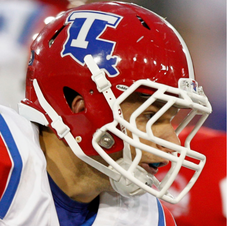
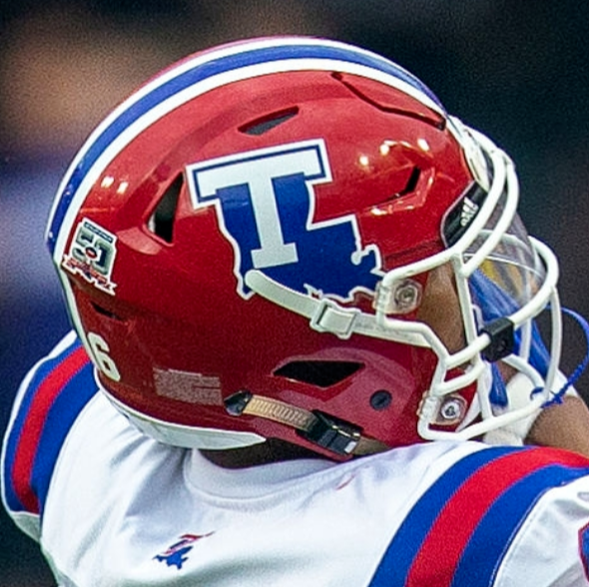
My favorite has always been the red helmet with the white "T", and a white stipe down the middle. But there are two versions of this; one has the single white stipe only on top, going down the middle (my fav #1) and the other version has a single blue stripe down the middle, surrounded by two white stripes on each side (my fav #2). Here's the two photos:
The problem with the 2nd version is that the 3 stripes down the middle looks a little busy, or crowed, and makes it look blended from a distance. Sometimes, it ends up looking "purple" from a distance. That's why I like the cleaner, less-crowded white stripe only, down the middle.
I expect there are some who want to see us in black uniforms. Blasphemy!
Oh God, no! Absolutely no black unis! No way, no how!

If we introduce any alternate colors, I would imagine it would be Columbia blue or maybe grey jerseys (which baseball, softball, mbb, wbb has worn).

 Posting Permissions
 Reply With Quote