It strikes me as SMU putting Dallas on their Helmets and Jerseys and the Baseball team putting Ruston on their Jerseys.
So Meh.

|
|
|

It strikes me as SMU putting Dallas on their Helmets and Jerseys and the Baseball team putting Ruston on their Jerseys.
So Meh.


I like the colors -
If they were going for pizazz I would of went "old school" with just the numbers on the helmet inside of the "oblong football"
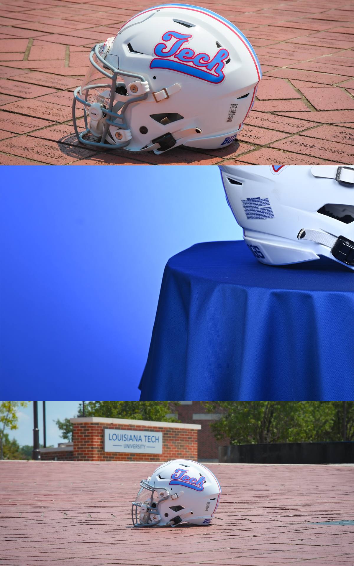
I hate that script - looks too much like Maryland with the "Terps" and USL with the "Cajuns"
Nothing unique about it
''Don't be a bad dagh..."

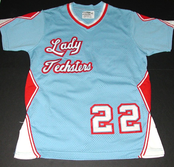
It's similar, not identical to the script of the Lady Techsters

The helmet they used before with the State-T in the columbia blue was great. Looked awesome - just a cool spin on the traditional helmet.Originally Posted by Dwayne From Minden

I agree...
Didn't need this
''Don't be a bad dagh..."
Kinda looks like Jech
Can you post pic of the helmet you liked? Thanks
Also, you know when a team/program sucks when fans focus on helmets and uniforms instead of players and games to come.
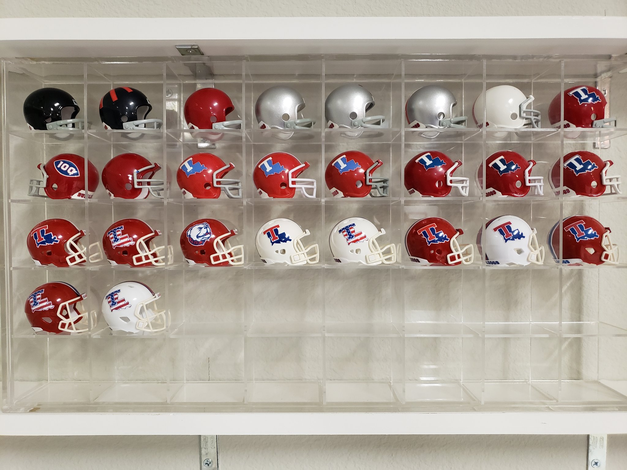
Here is our helmet history of of 2019
Exactly what I was thinking…

Its wimpy just like our program
No it's a LAZY half-assed design
I don't mind alternates but use some imagination -
Use the 100 football logo and put the players # in the football or 130 for the 130 anniversary of the school - THEN you are doing something meaninful
This is just plain LAZY
''Don't be a bad dagh..."


The decal shouldn't garner it's own preseason marketing. If we were to introduce a new set of uniforms unlike what we've seen before, I think it would be valid of us to promote. For a decal sticker change on a helmet, I think it would of been best to surprise everyone the week of wearing it.
Now that we have both red (best) and white (fine) helmets, and patriotic, columbia, and now script "Tech" decal variations, plus red, white, reflex blue, columbia blue combination options for jerseys and pants - what true uniform changes would be acceptable?
I mean, beyond just "fixing" the stripes or shoulder numbers or that kind of thing (which would be great).
I'm pretty firmly out on a grey or black option. Don't like that at all (for us). Wouldn't want us messing with the shades of blue (other than the 2 we have, which are awesome) like Oregon or Baylor do. I don't think silver helmets would be good. Maybe a matte red? A blue helmet option? A "piney hills" pattern? Old school bulldog with a beanie on the shoulder (like oregon's cartoon duck)? What else could there be? Camo?
There is a really old Tech logo that you can see in the old lagniappes that I don't totally hate (it's WAAAAAAAAAAAAAAY better than the La-State-T-ECH "sports" logo). It's kind of an oval with "La Tech" where the bottom of the "L" and the top of the "T" stretch around. If Homefield would ever pick us up, I'd totally be interested in a throwback that used that. But I don't think I'd want it on our jerseys or helmets. It's not as good as the (classic) State-T. But if you just had to have something, this has history behind it.
Keep it simple...
https://www.youtube.com/watch?v=nuda1sk9zM8
I like the red.
 Posting Permissions
 Reply With Quote