

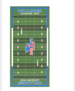
Not a fan. The State T should stand alone. Also, transparent end zones?
The La[StateT]ech was the worst thing to come from the Dooley era.

|
|
|


Not a fan. The State T should stand alone. Also, transparent end zones?
The La[StateT]ech was the worst thing to come from the Dooley era.

That looks terrible
These people wont stop until everything is ruined. Not only the State T, but those endzones are horrific
Since they have to redo the conference logos, maybe they can do the rest correctly this time. Who the hell signs off on these decisions?
Watch these jackasses paint “ @ Ruston” behind the logo
This crap is horrible
man, we Tech'd that up right from the start.

I agree. It's so ugly, I can't believe we put it on our fields/courts.Originally Posted by Bill Brasky

Why do we continue to get rid of the State-T? How long has it been in the middle of our football field? It's like we're trying our best to kill tradition and make everything uglier.
Concerning the endzones, what have we had throughout the years? I know when we got turf, they added the TECH surrounded by shoulder stripes and then they got rid of that for BULLDOGS.
Where is this from? Was there an announcement?

Even the shade of blue seems off to me, or do I need to clean my glasses?

That rendering is just a placeholder in the ULS agenda packet for their board meeting
''Don't be a bad dagh..."

I disagree and Agree.
I think the emblem in the middle of the field looks great. I actually like it better than the single T.
However, I want the "shoulder pad" red and white stripes back in the end zone.


The midfield logo doesn't bother me, I could either go with the State-T vs LATECH State-T.
The endzones, like Hogdawg, I like the shoulder stripes. It's unique and gives it character.
Putting the name of the institution in the endzone under "Bulldogs" is unnecessary. You already have the logo at midfield and red/white/blue color scheme, no one will mistake which stadium it is on TV.
I do like the alternating grass shades.
Ryan Ivey confirmed that is not the final design - apparently a placeholder in a draft lease agreement between the University and Foundation.
We should have given the $900k spent on this to send Cumbie to his next analyst gig early!
 Posting Permissions
 Reply With Quote


