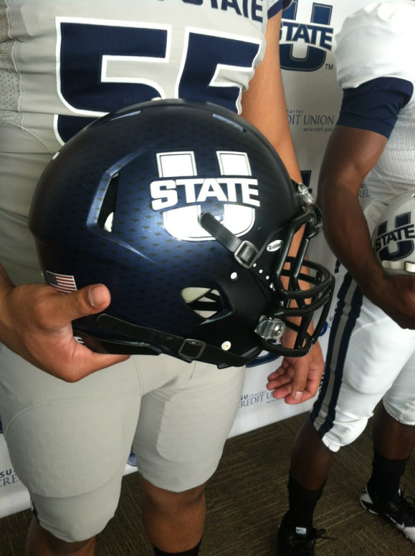
I think they look fine. I like how the helmet stripe narrows to points in the front.
Seems relevant to this thread (and the occasional discussion about alternate black uniforms):
http://www.npr.org/2012/04/26/151383...more-penalties
Utah State introduces new logos and uniforms.
http://www.theupsetblog.com/2012/04/...new-logos.html
New logo
New football uniforms
I like their new uniforms better than their old ones, but I like their old U-State logo better than the new one.
Several teams have been going gray. Apparently gray is the new black.
I don't see how that logo is an upgrade.
Last edited by Dawg06; 04-28-2012 at 02:47 PM.
The new logo isn't bad. Makes the "state" more prominent so it would be easier to see I guess.
Old logo
The helmet is pretty awesome though.
I like their old logo better because "state" fits inside the "U" which makes the outline of the old logo simple. The new logo looks like they cut out the center to add "state." It just doesn't appear unified like their old one, if that makes any sense.
I thought their old logo was unique with the vertical "state." The new one looks like they copied Mississippi State, Iowa State, and even Oklahoma State.
That was probably the point. They are trying to be to Utah what MSU, ISU, and OSU are to their states. Part of it is having the look. The problem with the previous logo is that the word "state" is too small to read. Now, it pops out to the reader. That is partly why those three have done it too I would think.
Looks a lot like Nevada's unis, I like the new logo with the state more prominent, not the biggest fan of the unis though, I didnt think the old ones were that bad.
They could have did a better job of making the State look like it wasn't just a photo that they pasted on top of a big U. Kinda looks like some Microsoft paint work to me.
Utah St had a lot of hype for such a lame logo.