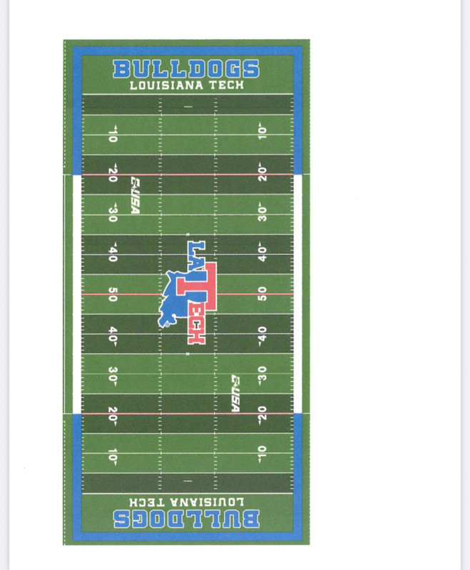
The main problem with the La-state-T-ech logo is that it's a hideous abomination. Other than that, it doesn't scale well, but that's not the problem here (it's just that's it's horribly ugly).
If you take that factor out, you could use it I guess.
I do always like the shoulder stripes in the end zones.

|
 Reply With Quote