Originally Posted by Dawgmatic

This one, the one I did on Photoshop?

|
|
|


This one, the one I did on Photoshop?

No no that's the one I like. Without the LA. Yours is better.

The reason why I like "LA TECH" is because it is unique and not forgettable. It has the potential to stand out as our recognizable nickname on a national level if marketed correctly (with a winning program). I think it will be nothing but good for the program, and it is very smart to go forward with this. I like the original logo too.

Why try to change something the athletic dept. has worked on and came up with for us?
Just go with it.
Hey, at least now no one thinks about the stripes!


Oh, yeah. Just wait:icon_wink:
Louisiana Tech University
Flagship of the University of Louisiana System

I'm hearing we are going OLD SKOOL -
They choose the one very similar to the one on the back of my left calf...

''Don't be a bad dagh..."

will the bulldawg logo be the old old school one with the freshman beanie cap?
Hopefully -
:icon_wink:
''Don't be a bad dagh..."
Found another version of the new logo's
https://www.choicesecure01.net/maina...lientid=latech

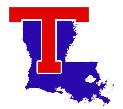
I don't think that is the correct shades of red or blue...
It's probably more easily reproduced in those colors. Much like the incorrect shape of the state.

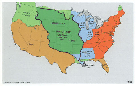
actually, after we get done with the WAC, we can put the T over the spain and oregon regions on that map.
The TAC/Malone blue blend is hard to produce apparently . . . .
Louisiana Tech University
Flagship of the University of Louisiana System

Here's your (exact louisiana shaped) state-t. I found a road map of louisiana and layed it over with blue. It also has all the nice ridges of the river along the eastern part of the state.
 Posting Permissions
 Reply With Quote